Software DevelopmentDecember 11, 2025
Dark mode design tips
An increasing number of designers and platforms are offering their users the option of using Dark Mode.
Isabelle Krauze, Roksana Radecka
- UI/UX Design

Technology is almost constantly present in our lives. As we interact with various websites, tools, and applications both day and night, the artificial, bright light of our devices' screens accompanies us at every step. Staring at our gadgets can strain our eyes (especially while looking at blue light in dark surroundings). An increasing number of designers and platforms are taking notice of this and are offering their users the option of using Dark Mode.

The main advantage of dark themes is their increased readability in low-light environments. Dark mode reduces the luminance emitted while still maintaining proper color contrast. It improves visual ergonomics and appropriately adjusts to specific light conditions
Each of these features makes it more pleasant to use technological devices in the evening or late at night. More interestingly, if your device has an OLED or AMOLED screen display, dark theme can significantly increase its battery life.
Because of its many useful benefits, dark mode has become one of the biggest trends in design, and many world-class brands like Apple, Google, and Facebook have already implemented dark themes. In support of its growing popularity, we’ve put together a short guide on how to create dark theme designs properly.
The principles of Dark UI Design
Dark UI design, while seemingly straightforward, encompasses a myriad of principles and considerations essential for crafting visually engaging and functional interfaces. In recent years, the adoption of dark mode across various digital platforms has surged, driven by both aesthetic preferences and practical considerations. The shift towards dark theme UI is not merely a trend but a response to the evolving needs and expectations of users in an increasingly digital-centric world.
The significance of dark UI design extends beyond its visual appeal. It plays a crucial role in enhancing user experience, particularly in environments with low ambient lighting such as nighttime or dimly lit spaces. By reducing the brightness of the interface, dark UI design mitigates eye strain and fatigue, offering a more comfortable viewing experience for users over prolonged periods.
Moreover, dark UI design contributes to improved accessibility by catering to users with sensitivity to bright light or visual impairments. The careful selection of colors, contrast ratios, and text readability in dark mode interfaces ensures that content remains accessible to a diverse range of users, regardless of their visual abilities or environmental conditions.
Furthermore, dark UI design aligns with modern design trends, reflecting a minimalist and sleek aesthetic favored by many users and designers alike. It allows for creative expression and differentiation while maintaining usability and functionality across various digital platforms and devices.
Don’t go too dark
Often, the first thing that comes to mind when creating a dark version of a design is too simply change the background to basic black (#000000). Although this may seem like a sensical choice, don’t do it — using a pure black background is a common mistake, as the contrast ratio is way off. It causes readers to squint and can lead to headaches. A very dark grey is a better choice for a dark background.

Avoid pure white text
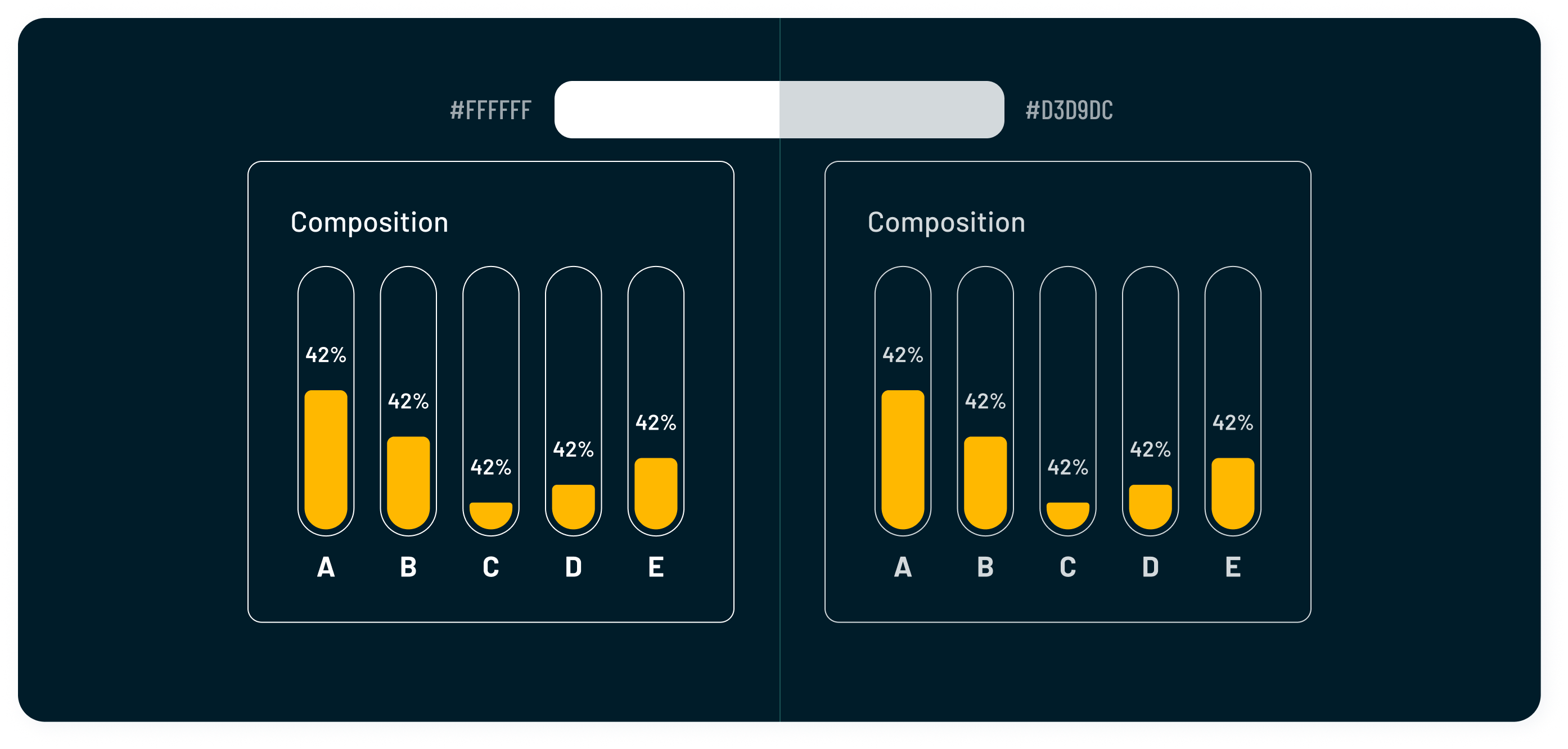
Light background or straight out white background allows you to use white fonts and elements, while dark surface colors limit your options significantly. While light text in dark mode design is the norm, exceptions exist. Embrace opacity adjustments, as they're invaluable tools. White text, often blurred on most screens, strains the eyes due to an optical illusion where light from the text spills into the background. Opt for a color scheme blending white and gray for fonts to mitigate this effect.
Desaturate colors
Consider making colors less saturated. This is to maximize accessibility — saturated colors don’t pass WCAG (Web Content Accessibility Guidelines) standard. Highly saturated colors may also cause eye strain and optical vibrations against dark backgrounds. Introduce accent colors sparingly to highlight important elements without overwhelming the UI. Utilize colors that pop against the dark background while maintaining harmony with the overall design scheme.

Limited Color Palette
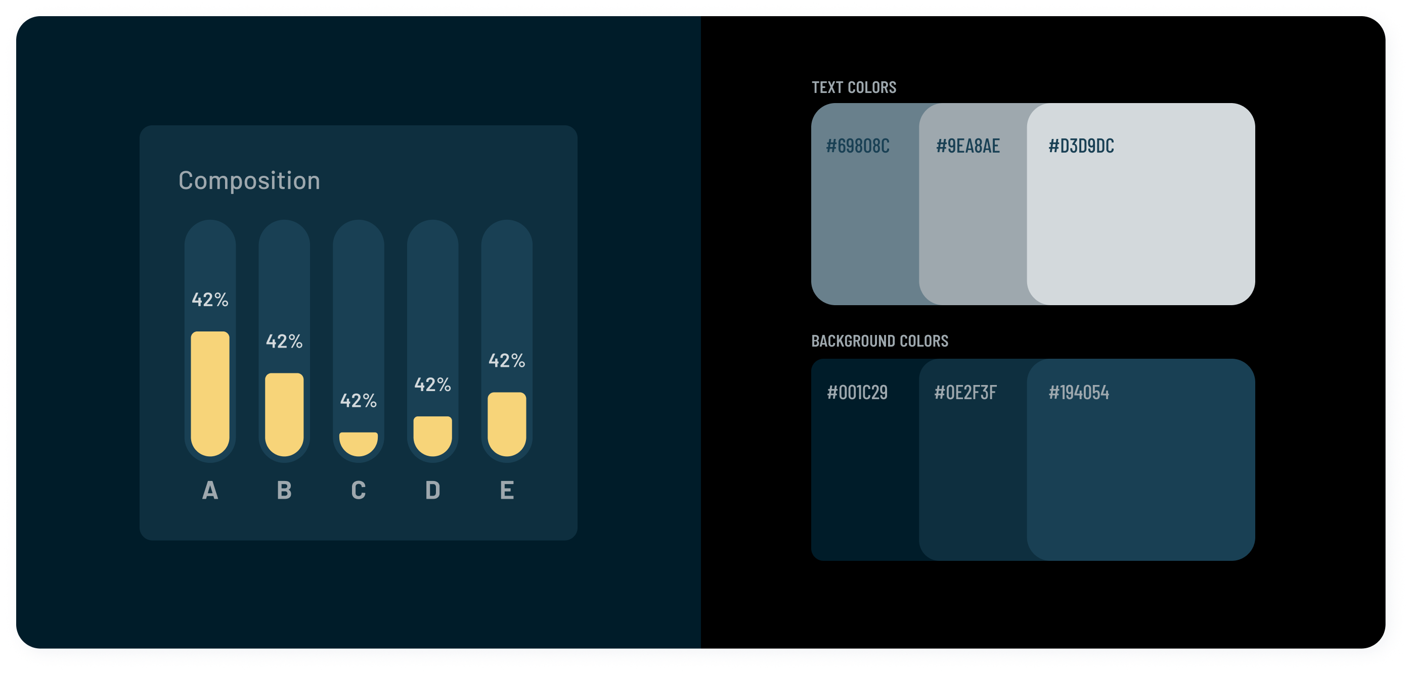
Utilize a limited color palette to maintain coherence and avoid overwhelming the user with too many colors. Choose colors that complement each other and contribute to the overall aesthetic of the interface.
You might feel tempted to use a fully saturated brand color, but it's better to find a more muted counterpart to fit the contrast requirements. A primary brand color, adjusted properly, could still make fully branded dark surfaces.
One of many factors you can play with to achieve an elevated surface is high and low opacity.

Accessibility
Adhere to WCAG standards to prioritize accessibility in dark mode design. Ensure sufficient color contrast, proper text resizing options, and keyboard navigation support for users with disabilities. The dark theme-specific guidelines make the solution more accessible. The most important rule is that the contrast level between the text and background should be at least 15.8:1. This increases readability, even if device surfaces are lighter.
Text Rendering
Optimize text rendering for improved readability in dark mode. Utilize anti-aliasing techniques and adjust font weights to enhance legibility without compromising aesthetics.
Communicate depth
As we know, shadows don’t work well in the dark. A better way to communicate hierarchy in a user interface is to play with brightness—as a surface rises in elevation, it becomes lighter in color.
Icons and images
Icons and images are crucial elements of design. Ensure that full-color pictures are optimized for both bright and dark background. When dealing with icons, create separate versions for light and dark modes to ensure optimal visibility, using the same color principles mentioned above.

Less is more
A fundamental element of a successful dark UI is using adroit negative spaces. Dark user experiences may appear too heavy to use. To counterbalance this, designers may create lighter, dark UIs by exploiting negative space within spare, minimalist designs.
Negative space is a useful tool for dark UI design that allows the user to access information.
Claude Debussy wrote in his autobiography of 1788: "Music was a place between notes".
Test UI components before you go
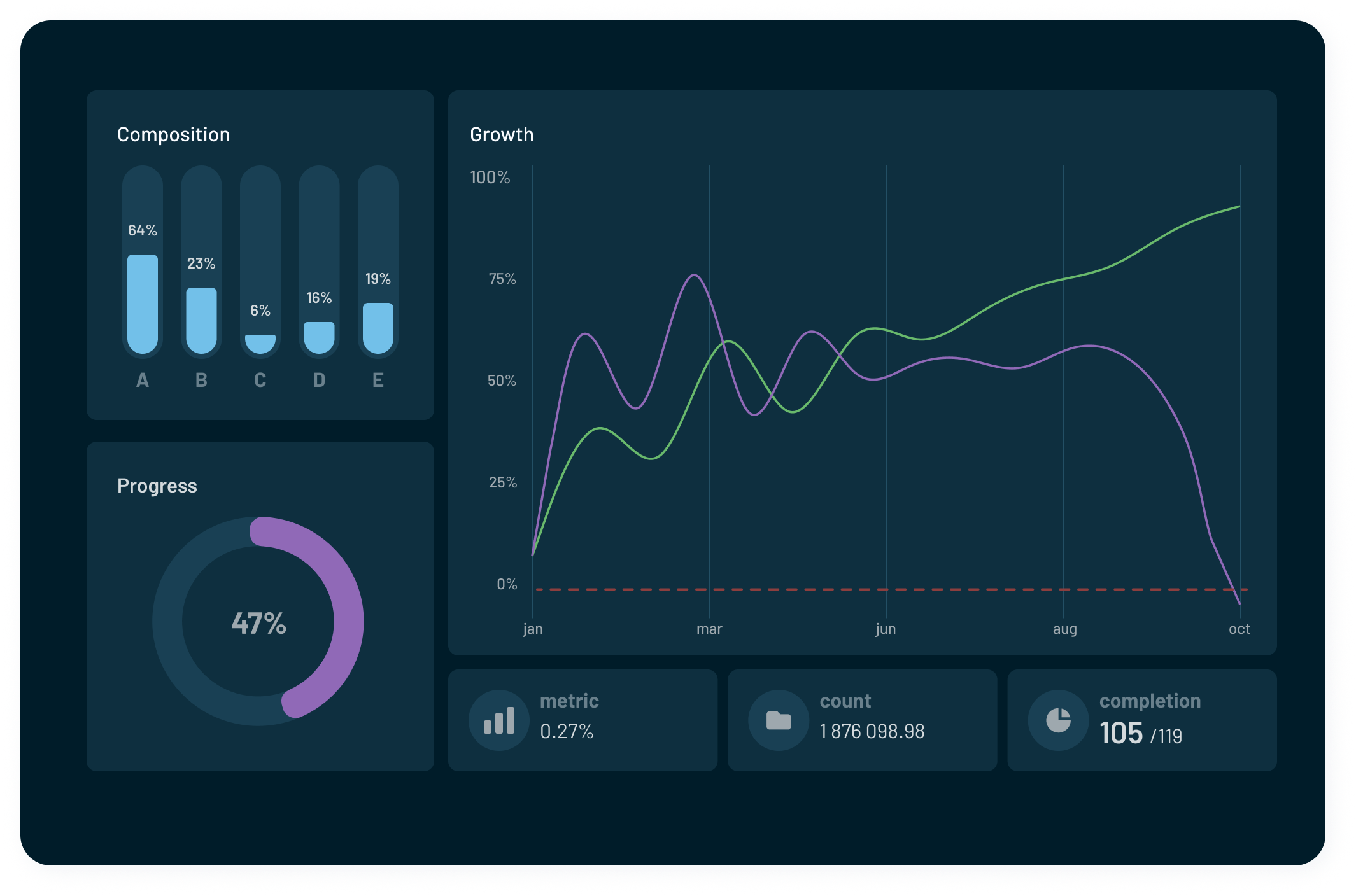
See how your UI looks in both appearances and ensure that the light and dark themes are well constructed.
For best results, you should also test dark mode at night and in low-light conditions. Ask users for feedback regarding dark theme implementation to identify areas for improvement and refinement. Actively engage with user communities to address concerns and iterate on the design based on real-world usage.
Once you’ve tested the functionality, you’re all set to allow users to switch from light to dark mode whenever they want!
FAQ Dark mode design
1. Why should I consider implementing a dark mode in my design?
Dark theme offers several benefits, including reduced eye strain, improved readability in low-light environments, and potentially extended battery life for OLED screens. Additionally, it provides a sleek and modern aesthetic.
2. Should I automatically enable dark mode for all users?
Offering a dark theme as an option is generally preferred, as it allows users to choose based on their preferences and lighting conditions and it can help to save battery life in critical situations. However, you can also consider implementing automatic switching based on system settings or time of day for a seamless user experience. Before making the decision, you should consider the following factors: user preferences, accessibility, contextual considerations, user control, and user feedback on digital products.
3. How to choose a dark theme primary color?
Choosing the dark theme primary color requires careful consideration to ensure visual appeal, readability, and consistency with the overall dark mode design. Here's a step-by-step guide on how to select the perfect primary color for your dark theme:
- Consider brand identity: Start by considering brand identity and existing color palette. Choose a primary color that aligns with your brand's personality and visual identity to create branded dark surfaces.
- Contrast and legibility: Opt for a primary color that offers sufficient contrast against the dark background to ensure the readability of text and other interface elements. A color with high contrast will stand out against background colors prominently and enhance usability.
- Harmony with dark background: Select a primary color that harmonises well with the dark background of the theme. Avoid colors that clash or create visual discomfort when combined with the dark color scheme.
- Accessibility: Prioritise accessibility by ensuring that the primary color meets contrast ratio requirements for text and interface elements against background colors, as per accessibility guidelines such as WCAG's aa standard.
- Test across devices: Test the primary color across different devices and screen sizes to ensure consistency and optimal visibility. Consider how the color appears on various displays, including mobile phones, tablets, and desktop monitors.
By following these guidelines, you can choose a primary color for your dark theme that enhances the overall visual appeal, readability, and usability of your interface while staying true to your brand identity.
4. What is dark mode design?
Dark mode design, also known as night mode or dark theme, is a user interface (UI) design trend where the predominant background color of an application or website is dark grey or black, with light-colored text and elements. In contrast to traditional light themes, which feature light backgrounds with dark text, dark mode flips this color scheme, prioritising darker colors for backgrounds and lighter colors for text and other UI elements.
5. What are the benefits of dark mode in design?
Dark mode offers several benefits, including:
- Reduced eye strain: Dark theme reduces the amount of light emitted by screens, which can help in reducing eye strain, particularly in low-light circumstances. This is because bright screens in dark environments can cause discomfort and even disrupt sleep patterns.
- Extended battery life: For devices with OLED or AMOLED screens, dark theme can significantly reduce power consumption compared to displaying bright colors. This is because OLED pixels emit their own light and can be turned off completely in dark areas of the screen, conserving battery power.
- Improved visibility of content: Dark theme can enhance the visibility of content, particularly for users with certain visual impairments or for those viewing screens in bright environments. Predominantly dark surfaces can make text and other elements stand out more prominently.
- Aesthetic appeal: Many users find dark theme visually appealing. It can provide a sleek and modern look to interfaces, especially when paired with complementary accent colors. Dark backgrounds can also make colors and images pop more vividly.
- Reduced glare: Dark theme can minimise glare and reflections on screens, especially in environments with overhead lighting or sunlight. This can further improve readability and comfort for users.
- Accessibility: Dark mode can improve accessibility for users with certain visual impairments, such as sensitivity to bright light or glare. Providing dark mode options can make interfaces more inclusive and usable for a wider range of users.
6. What's the difference between light and dark themes?
Light mode design typically features light-colored backgrounds with dark text and elements. In contrast, the dark mode design utilises a black background with lighter text and elements. While light mode is the traditional approach, dark theme has gained popularity for its visual appeal and ergonomic benefits.
7. What colors do you use for dark mode design?
When designing for dark mode, it's crucial to choose dark color palette that maintain readability and visual hierarchy. Opt for softer, muted colors for text and UI elements to avoid harsh contrasts. Dark gray, muted blue, green, and other desaturated tones work well for backgrounds, while lighter shades provide contrast for text and accents. Experiment with color palette to find combinations that enhance readability and complement your dark theme aesthetic.
8. Should I use shadows on a dark background?
Using shadows on a dark background can enhance the visual depth and dimensionality of your interface, but it should be done judiciously and with consideration for the overall design aesthetic.